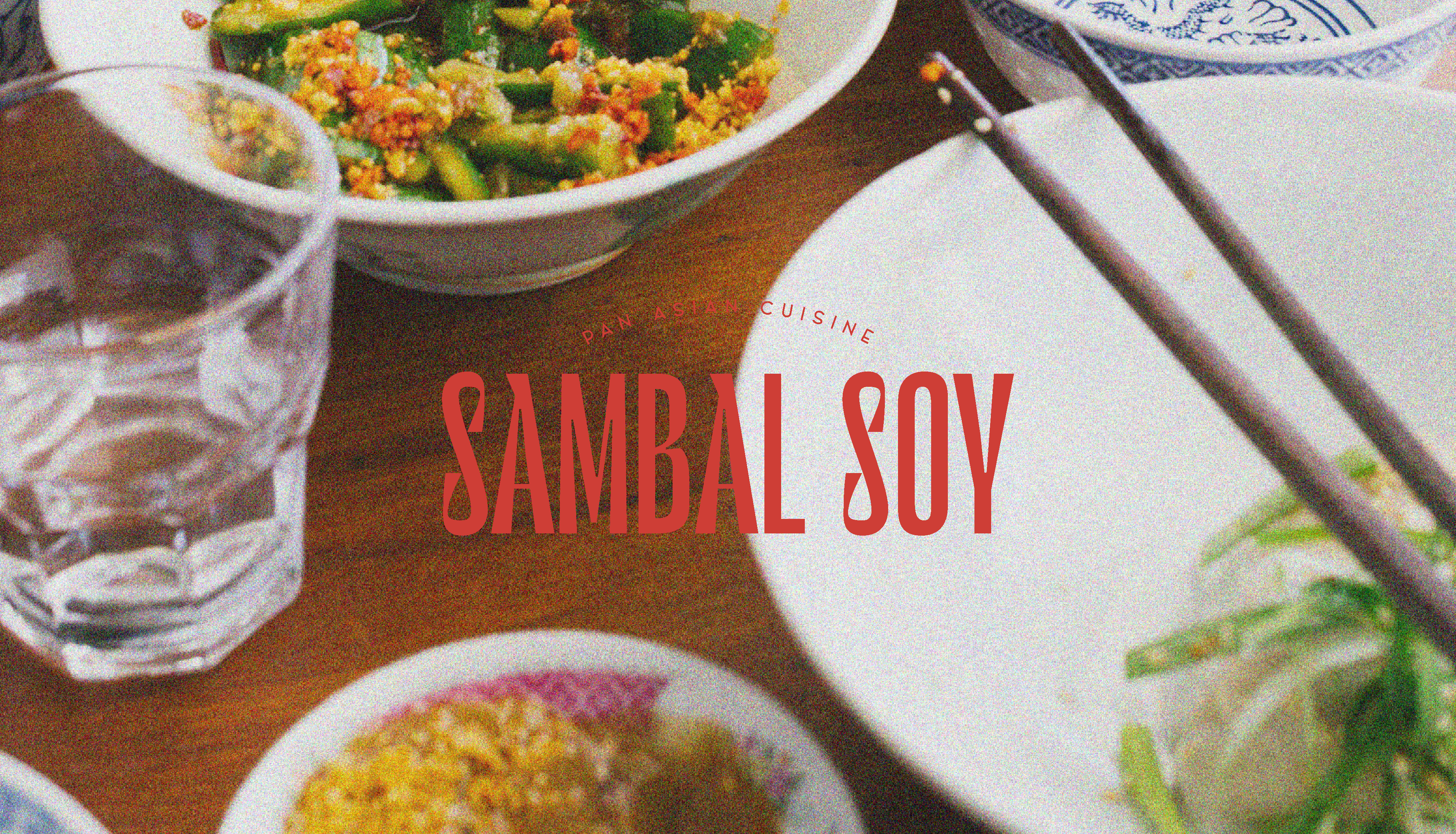
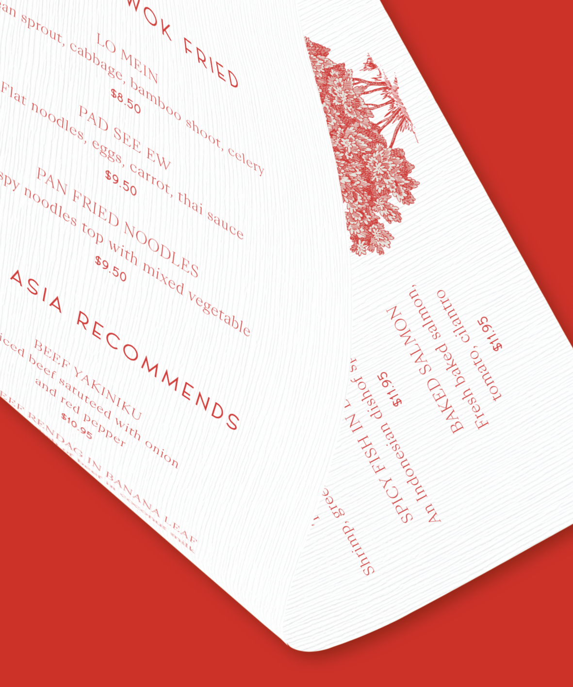
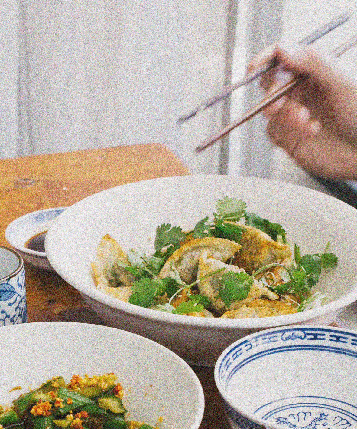
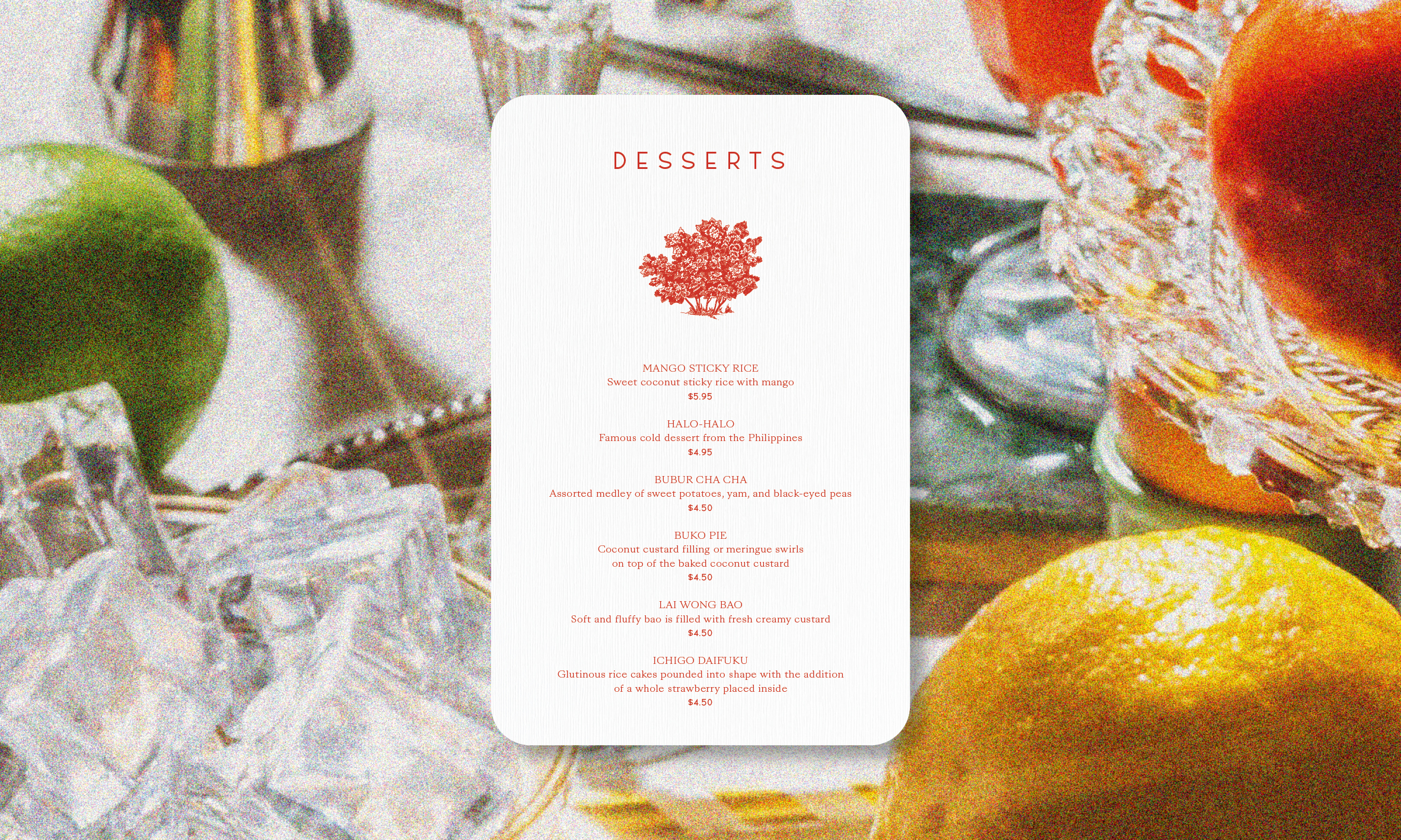
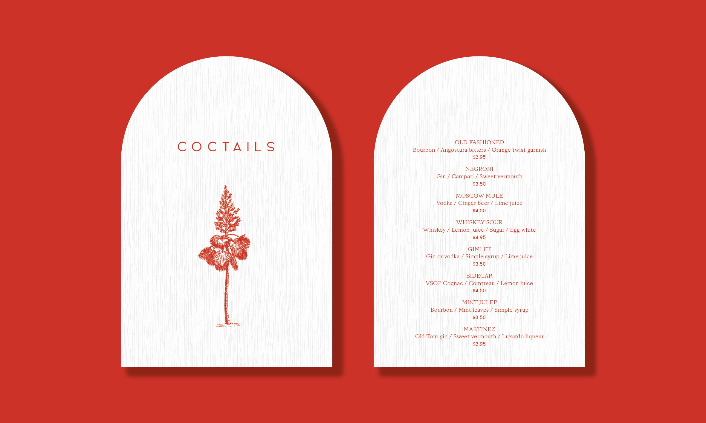
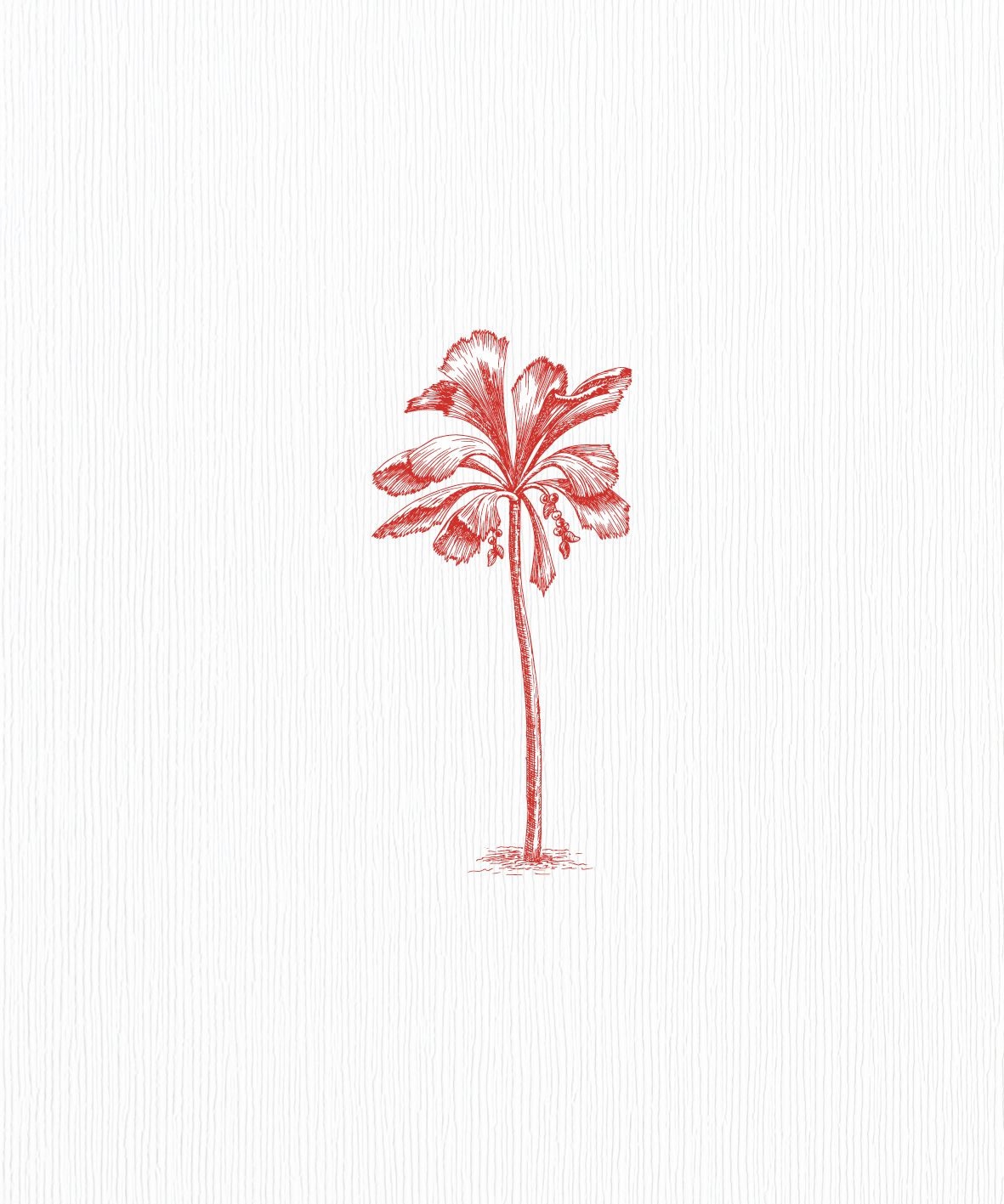

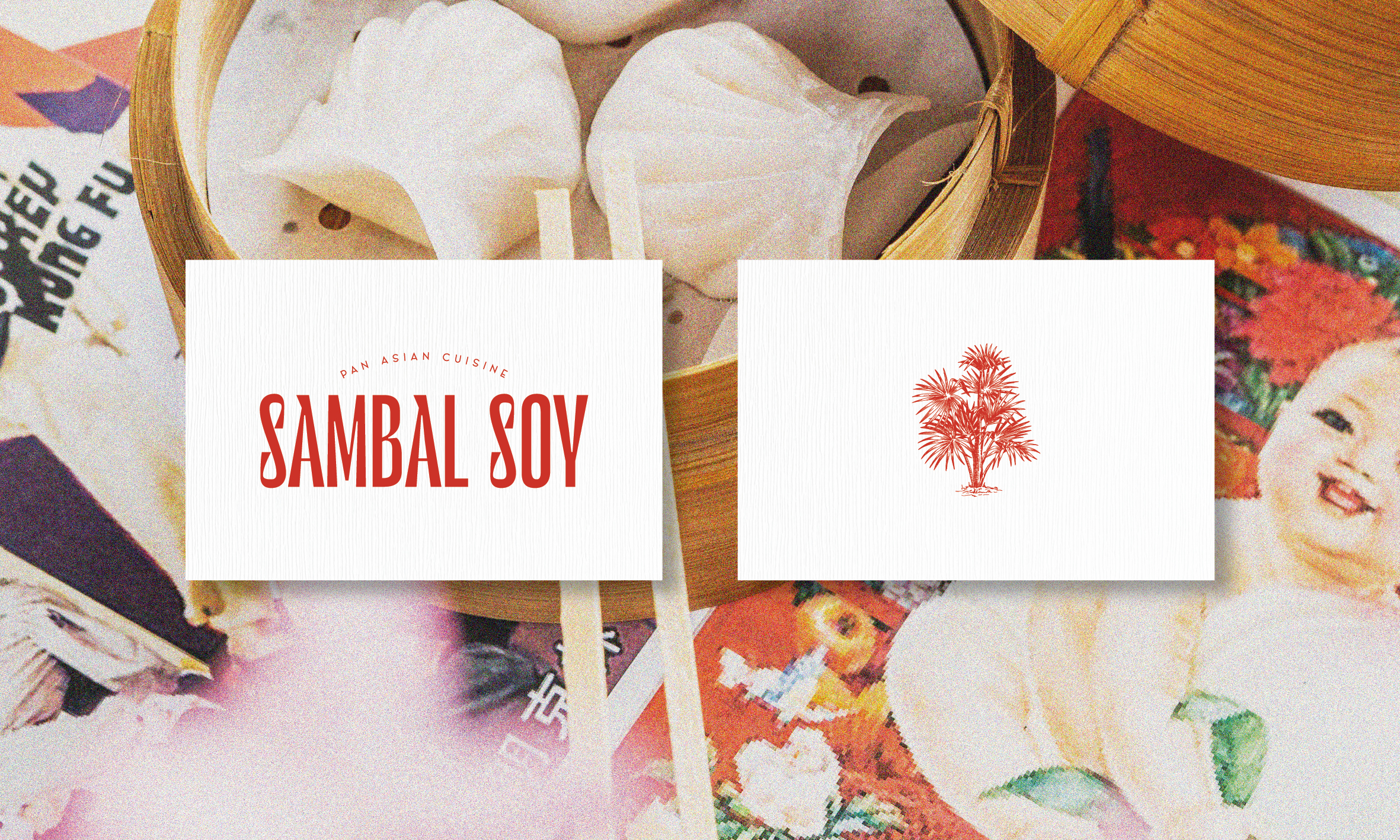
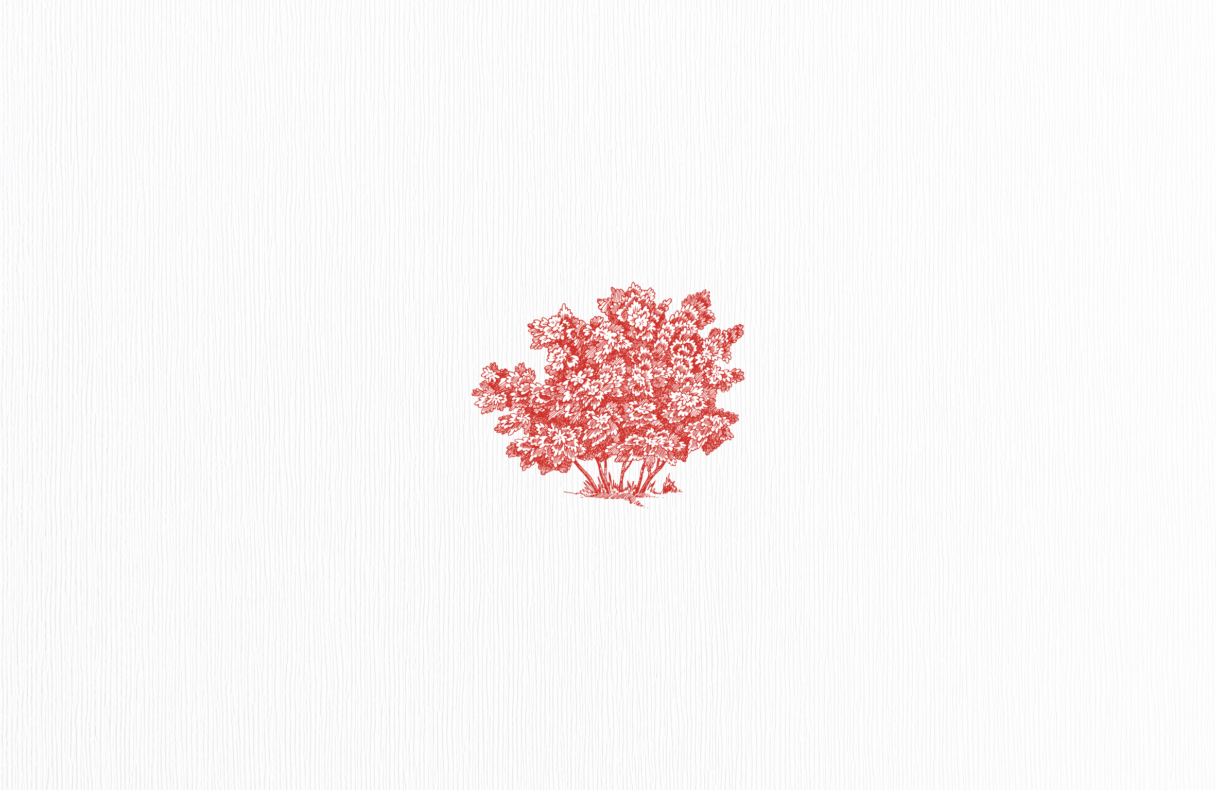
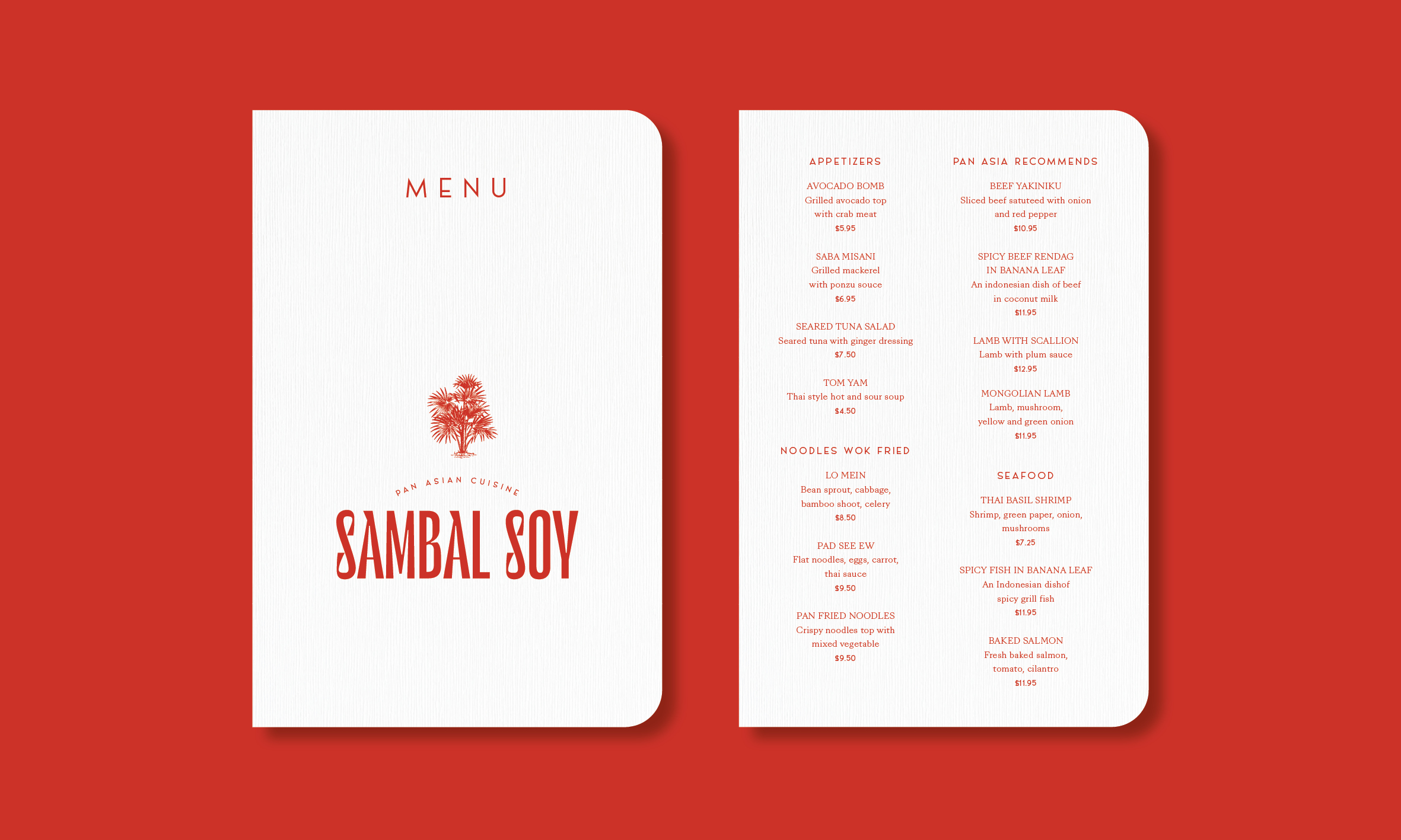
Brand identity design for asian restaurant. Logo design adapts serif type, showing the brand's playful and modern style, expressing a classy but not taking itself too serious attitude. I chose tropical flora as graphic elements, which are echoed in almost all visual elements. Combining the pattern with red, the whole identity of Sambal Soy is formed. It's classy, elegant, and modern. I made the printed elements unique with rounded shapes and used textured creative papers for printing.
| Project | Sambal Soy Restaurant |
| Type of work | Branding |
| Date | 2021 |